Amidst the busy wedding season, we find it is immensely important to continually create. We were in Washington D.C. and felt so inspired by the historical sense of the city.
OUR PROCESS
As part of our design process, we always begin by finding inspiration in places that are not obvious. Rather than copying another design or editorial, we look to art to find images, textures and colors that inspire us. Consequently, our designs feel fresh and inspired rather than versions of designs that have already been created. Almost every design we create is inspired, on some level, by our travels. Because we travel often, we look to architecture, art, and culture for subtle design ideas.
The Design
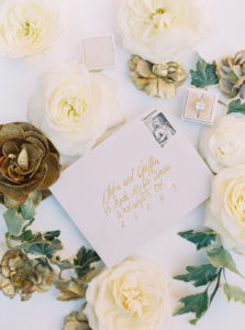
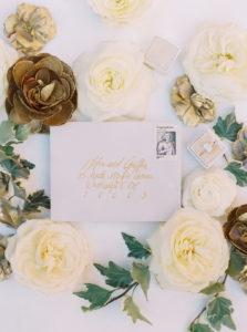
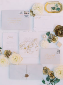
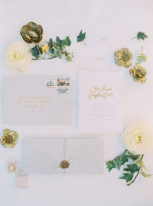
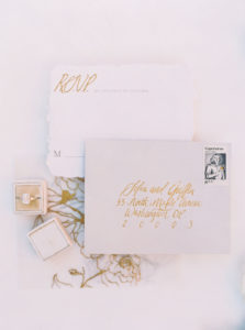
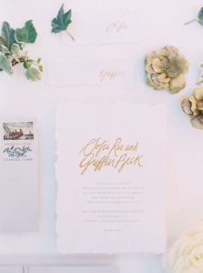
Define inspiration! Our inspiration for this shoot was found while traveling in DC and reflecting on architecture and old world details. Inspired by an old world feel, we opted for wax seals, calligraphy, and gold foil.
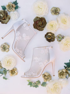
Create a unique color palette. The color palette was refined and elegant. We chose gold and stone as our base with an organic forest green to complete the look. As a result, the design feels timeless and organic, yet bold. Above all, we wanted a color palette that could be applied to many different venues. This palette doesn’t just apply to an outdoor setting. It would be similarly gorgeous indoors.
THE GOLDEN AGE EDITORIAL
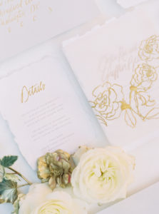
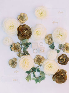
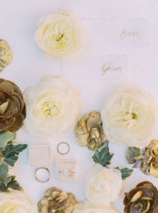
Collaborating with Ink & Press Co, we knew we wanted a design that felt feminine and romantic but held to an old-world aesthetic. Using shades of stone and gold with calligraphy, vintage stamps, and handmade paper created just the right amount of antique elegance and modern romanticism.
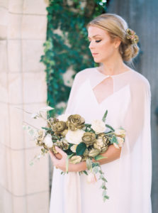
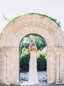
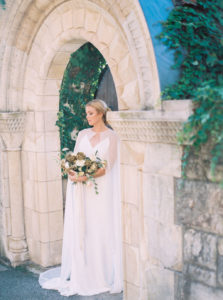
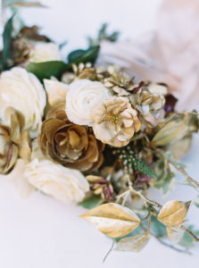
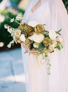
Our floral design was inspired by objects frozen in time. While flowers have a naturally fleeting life, the use of bronze in this design gave them a gilded feel that matches the permanence found in classical architecture. Even more, we wanted to create a look that felt as timeless as the architecture that inspired us. In contrast to the timeless, antique aspects, we wanted to pair some modern aspects. Most noteworthy is the bride’s chiffon cape. Rather than opting for a stark, modern dress, we chose a modern option that was soft and romantic. Because of this, the overall look transitions from antique to modern effortlessly.
If you are interested in learning more about our editorial design process or working with us to develop your brand or portfolio, visit our education page found here!
See more from this editorial featured on Wedding Sparrow
Photogrpahy by Mary Claire
